Long before terms such as “great room” and “bringing the outside in” were part of the common vernacular, Northwest architect Roland Terry was fluent in both of those concepts. He was not only an architect, but an interior designer who cared deeply about how the inhabitants of his spaces actually lived in them. His goal was to facilitate their ability to do so comfortably and informally. He arranged furniture into conversation areas and paid attention to cooking, dining and entertaining. Sixty years later, one of his signatures, Canlis Restaurant, still stands as an icon of classic design.
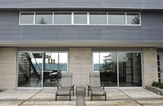
In 1968, Terry was commissioned to design a home for a Mercer Island family on one of those rare pieces of property that has access to stunning vistas from east to west. He created a low-slung, horizontal house that snuggled into the land with a great room and an outdoor dining area that brought in the beauty of the surrounding lake and territorial views. Flash forward to 2006, when the well-loved home was put up for sale. It was purchased by a young Mercer Island family with dreams of updating the existing structure while keeping its integrity and character. They selected modernist architect, Eric Cobb, who first caught the attention of the homeowners for his work on steep slope building and cantilevered structures. He had a reputation for being a problem-solver with an eye toward value and incorporating cost-effective materials. Together, they had been looking at various properties with renovation potential until this home came on the market. It was quickly decided that they had a real find.
The new architect had immense respect for the original. For that reason, Cobb very purposefully designed an addition with clear exterior distinction between the old and the new. The existing home with its strong horizontal lines and extensive use of natural stone was contrasted with Cembonit (a cement and sand mix) horizontal siding panels for the second-story “box.” The foundation was strong enough to support the addition, almost as if it had been designed with a future upper level in mind. Inside, there is no obvious distinction between the old and new levels — they seamlessly connect with one another and the landscape, opening to full 360-degree views from the top.
Cobb described the end result as “being a synthesis of both spaces.” The original great room stretched out horizontally; the addition expanded the space vertically, giving the room double its original height. Natural light now pours into the space from walls of windows.
“The most important aspect that architecture brings is control of light and space, and using structure to do this. Structure is the form and element that allows light to penetrate or be blocked. This creates endless opportunities,” said Cobb.
From Cobb’s architectural perspective, finish, color and texture are secondary to light and space. The domination of any of these can overwhelm a space and cause the other elements to get lost. For example, the richly grained, warm, Anigrey hardwood cabinetry throughout the home is contrasted with blackened steel beams, white walls, natural stone fireplaces and espresso-stained oak floors. Each element contributes to this composition of style. The architect is a purist when it comes to paint color, preferring the simplicity of white walls. He said, however, that “it is very difficult to select the right white.” After examining how various whites interacted with the different types of light coming into the space at various times of the day, they made their selection of a color called “Pearly White,” which is warm and bright.
The style is unmistakably modern, but Cobb pointed out that it is different from minimalism. Modernism is all about exhibiting restraint. It permits the special materials that are selected to be the stars against the supporting actors.
In many ways, the great room fireplace is a metaphor for the entire project. Because the original sandstone blocks could never be matched, the fireplace was extended upward with the addition of blackened steel, repeating the use of that element and juxtaposing the two materials. The stone surface above the fire box purposefully remains bare so that the materials can play off of each other without interference. The original firebox was converted to gas, and a linear flame emerges from an understated blackened steel box filled with crushed glass. The effect is an elegant horizontal line of fire.
Much of the project’s success is credited to the collaboration between architect, client and builder. They used Flip Builders and were impressed with their ability to creatively problem-solve. The fireplace is a good example of that. Cobb had a vision of creating a “box of fire” within the existing fireplace, and the builder was ready and able to figure out a way to execute that concept. Cobb pointed out that this is not something that you can just go out and buy; it was created.
All of the individual elements of the home were considered and weighed with respect for the existing structure, balanced with the lifestyle needs of the current dwellers. It appears that Cobb accomplished the mission, and Terry would have been proud.
Lori Matzke Ehrig is an interior designer and freelance writer. She can be reached at dlehrig@msn.com or (206) 271-5550.


